Every December, Spotify Wrapped takes the world by storm. Social media buzzes with colorful, shareable slides of our top artists, most-streamed songs, and the minutes we've spent immersed in music. It's a delightful feature that turns our listening habits into a celebration of personal taste. But as much as I love it, I can't help but think: what if Wrapped showed more?
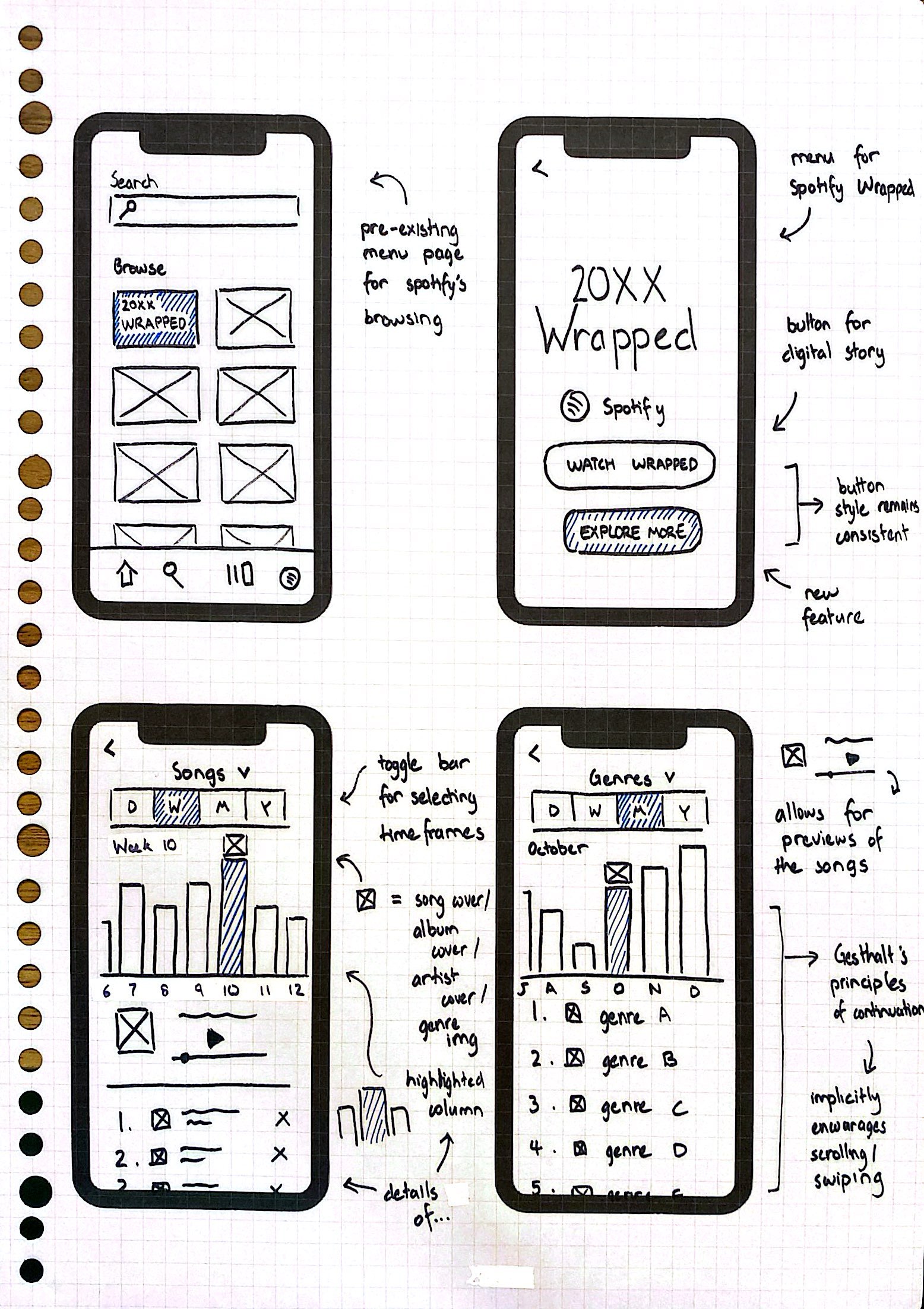
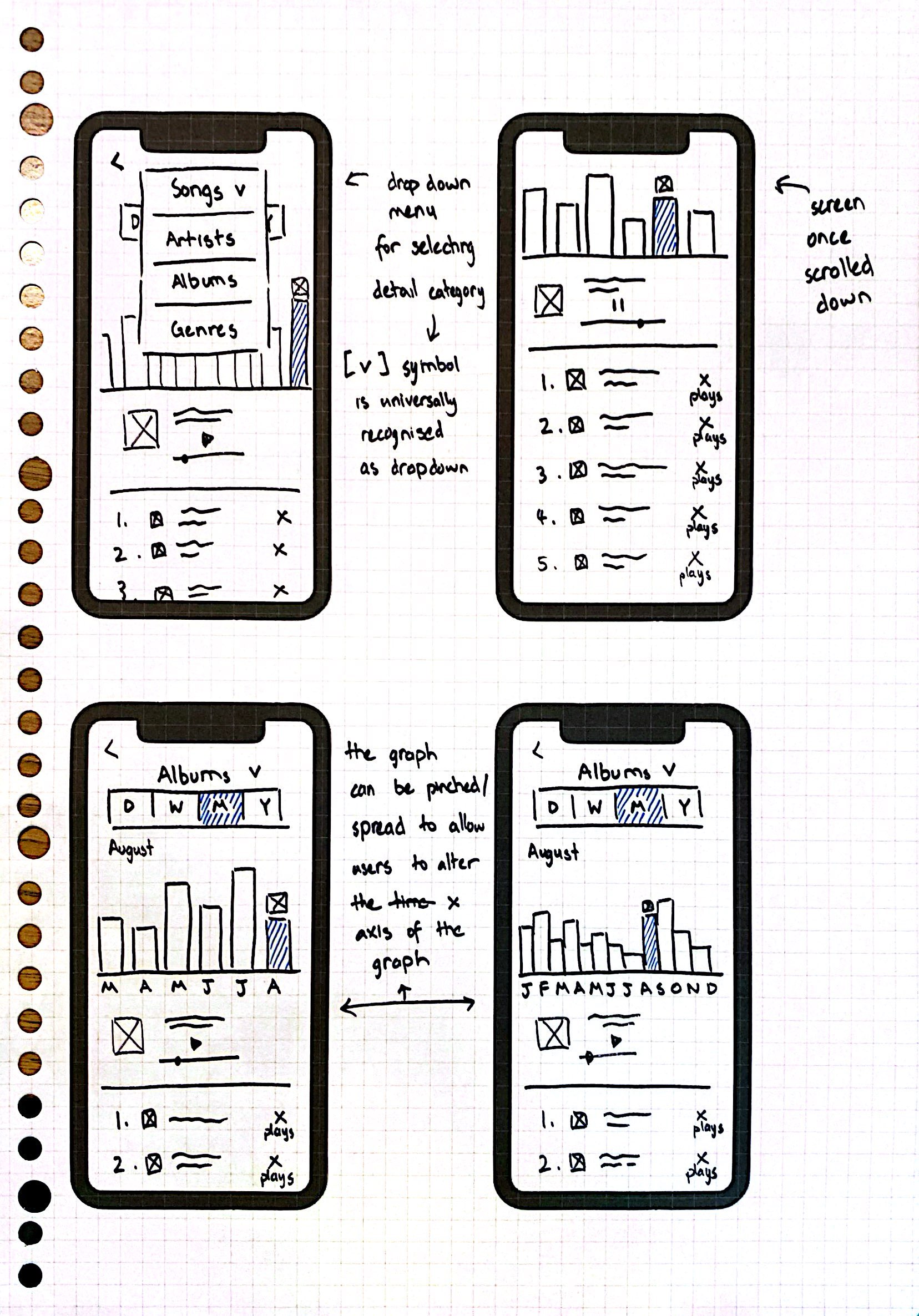
Imagine if Spotify allowed us to dive deeper into our listening statistics—not just for the year, but across different categories and timeframes. As a UX designer, I couldn't really help myself and drew up some wireframes to see how this feature may look.


I created a series of wireframes to illustrate how Spotify could enhance its listening statistics feature by allowing users to explore their data across different categories and timeframes. The wireframes showcase a clean, intuitive interface that organises listening insights into customisable sections, such as songs, genres, artists, and albums. Users can filter their stats by timeframes like days, weeks, months, or even specific years, and view interactive visualisations such as charts and graphs for a deeper understanding of their music habits. These designs prioritise both clarity and interactivity, creating a seamless experience that transforms music data into engaging and actionable insights.